Modern Cottage Inspiration
I am nervously dipping my toe into the Seattle real estate market and each time I try it feels too cold to dive in. Open houses in Seattle are a little terrifying. People are there to put in offers. You walk through the threshold and before you know it, the price of the house has shot up one to two hundred thousand dollars while you are standing there thinking about where you would put your couch.
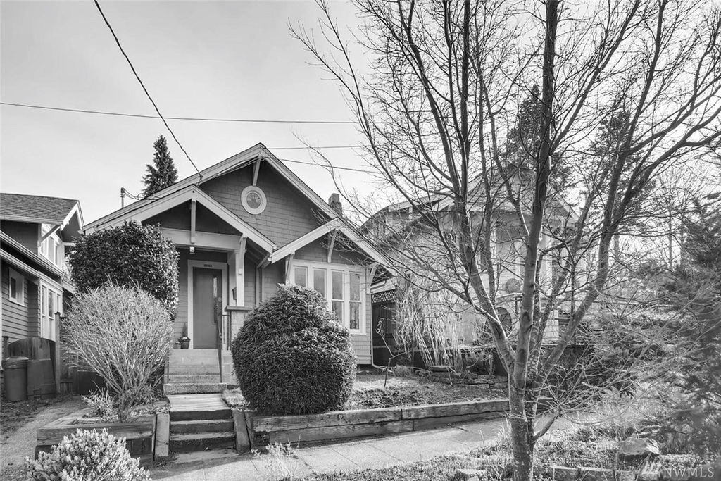
Such was my experience yesterday at a house in my dream neighborhood of Wallingford that seemed to be in our price range. I spent a lot of time in the last few days dreaming about what I would do with it, especially because there were quirky things about the house that I wasn't even sure I could get past. Once I figured out solutions, it was already too late for me. So I thought I should write them down somewhere.
Here's the Wallingford house (think of these as "before" photos which is why I made them black and white):
Typically, you'll see only two kinds of houses in Seattle: craftsman and mid-century. Seattle is a fairly young city and has had a few modern day economic booms that have driven population explosions. The early 1900s birthed the craftsman. Post WWII proliferated the midcentury. (And the 90s tech boom gave the outlying Seattle suburbs the colonial-style, two-car-attached-garage, mini-McMansions from New Jersey.) So If I'm going to stay here, this is what I have to work with.
For a craftsman house, I would want to feel like I'm coming home to a retreat at the end of the day. Since moving to Seattle, I have often said that living in the Pacific Northwest is like being in your vacation house all year. The summers are gorgeous. It's in the 70s and 80s every single day. And there is not a cloud in the sky for four whole months. But then the rest of the year it's rainy and overcast. It's like going to the Cape in the off season, but a little warmer and people are still walking around.
So, if I'm going to live in my vacation house for all 12 months of the year, I need it to look like a modern cottage. It should be cozy and relaxed, but also a little cosmopolitan. It should mix rustic woods, textured fabrics, matte and glossy finishes, neutral colors, and elegant furniture. It should have modern amenities and flow in a way that follows your daily foot traffic patterns. And it should serve as a background to feature your treasures because your home should reflect your memories.
My inspiration is something like the cover photo above from Workstead's Rivertown Lodge project or their Gallatin House project (below), both in Hudson Valley.
Back to the open house. The outside is cute, but maybe a little too cute for me. It's slate blue with a bright red door and white trim. I would want it to be a little more modern and minimal. I'd paint the exterior and trim a creamy white and replace the door with a simple shaker wood style with a natural or glossy black finish (and eventually I'd put a farmhouse roof on it). And I'd replace the landscaping with tall grasses, a couple of Japanese maples, and slate edging to replace the railroad ties. Workstead's Gallatin House and MAP Architect's Carmel-by-the-Sea farmhouse (featured on Remodelista) are good examples. I like them because there's a lot going on with the exterior of the Wallingford house, and painting it a single, neutral color let's you appreciate some of the architectural features better.
Workstead's Gallatin House
MAP Architect's Carmel Farmhouse
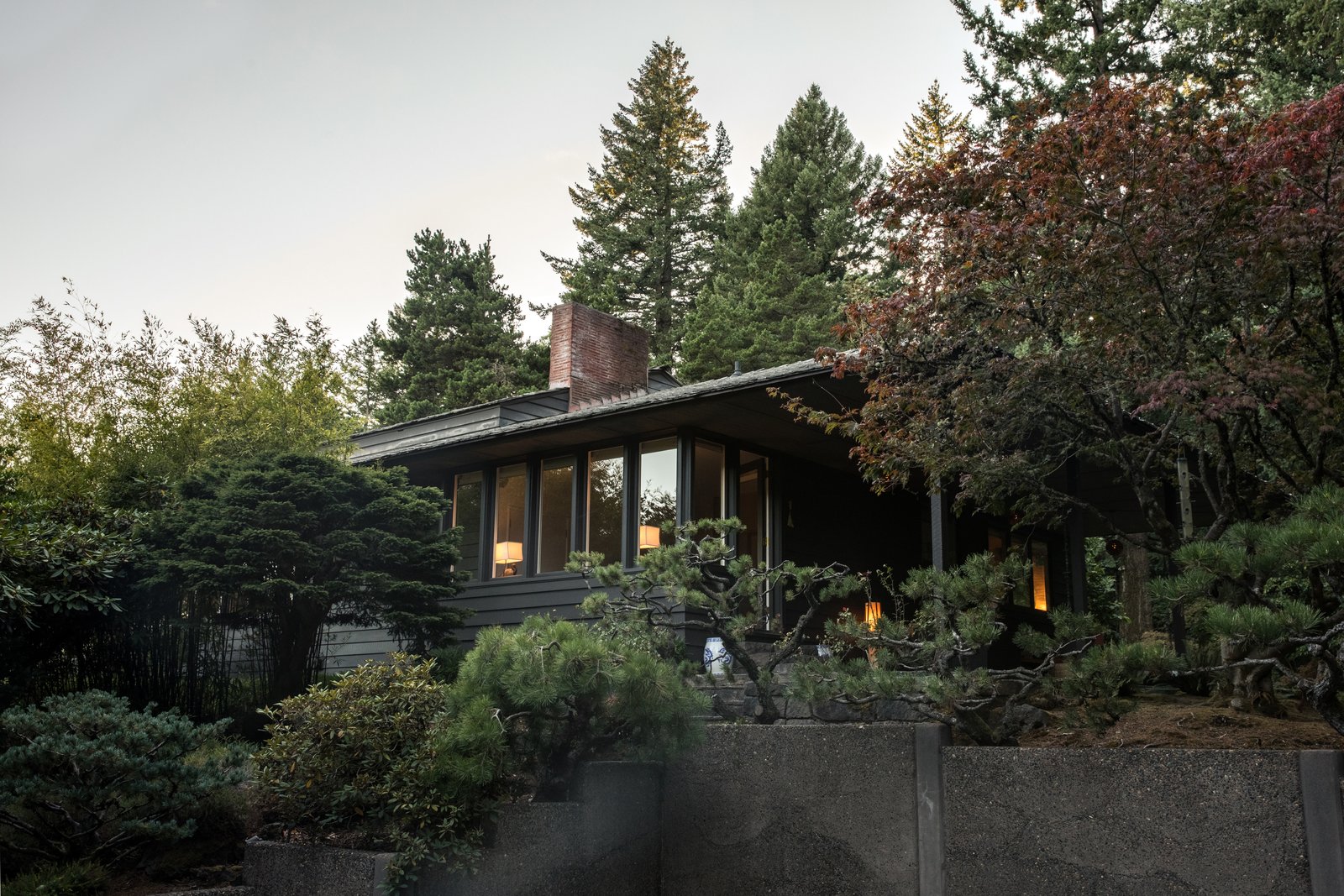
Japanese-inspired landscaping for the Sutor House by Florence Holmes Gerke and inspired by the landscape designer Jiro Harada. Pietro Belluschi is the architect for this Portland, Oregon, house featured in Dwell Magazine.
The living room and dining room of the Wallingford house present challenges common in many craftsman houses in Seattle. Everyone wants an "open-concept" living/eating area now, which means one space for your living room, dining room, and kitchen. So when investors flip houses, they tear down interior walls and leave these partial dividers that are structural. It makes it feel open, but not necessarily cohesive, like in the Wallingford house. The kitchen is still separate in the Wallingford house, which you could easily change down the road.
In my fantasy, I would tear all the interior walls down and expose the roof beams to make one great room and push the bedrooms to the back, but that is probably a $200,000 job in a house that already exceeded my budget the second I walked in the door.
In my slightly more realistic dream, I would make the fireplace the focal point and pretend it's one room. By painting everything around the fireplace (including the ceiling and trim) a medium-dark color like Benjamin Moore's Chelsea Gray (similar color in the photo below from Domino Magazine's photo gallery) or Revere Pewter (similar color in the photo below of Eben House's entryway), suddenly the contrasting white fireplace is at the center and the partial divider falls into the background.
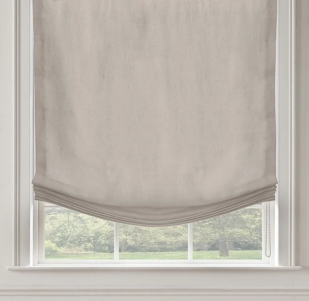
I would flank the fireplace with L-shaped furniture to visually centralize it and maximize the usability of the space. On the right side, I would tuck a banquette into the corner of that perfectly charming window, hang linen roman shades, and place a Chippendale pedestal dining table. In front of the fireplace, I'd position two Louis rectangular-backed natural wood armchairs for reading that you could also pull up to the dining table, and above the fireplace I'd hang a Federal-style convex mirror with an eagle on top.
From left to right, pictured above:
- West Elm banquette
- Regency pedestal dining table from Chairish.com
- Linen relaxed roman shade from Restoration Hardware
- Federal convex mirror from Chairish.com
- French armchair from Restoration Hardware
On the left side of the fireplace, in what is currently the "dining room," I would place a modern linen sectional sofa so that you can still see out of the front window, a vintage trunk for the coffee table, art above the short side of couch, a paper Nelson lamp, and matching linen roman shades on the window.
From left to right, pictured above:
- Restoration Hardware sofa
- Nelson Saucer Lamp from Design Within Reach
- "Jane Gallagher" print from Minted.com
- Vintage steamer trunk from Chairish.com
Finally, I would bleach the floors to that natural unfinished wood Scandinavian look and leave them bare (no rugs) so that it feels both casual and united like all the photos above. Alternately, you could do one giant custom rug that goes almost to the edges of the wall, but that's expensive.
These are the things that run through my head as I browse Zillow hoping to find adulthood in real estate. If you made it all the way through, thanks for reading and I hope it gave you some ideas!


